BBLUNT Salons Branding
Brand
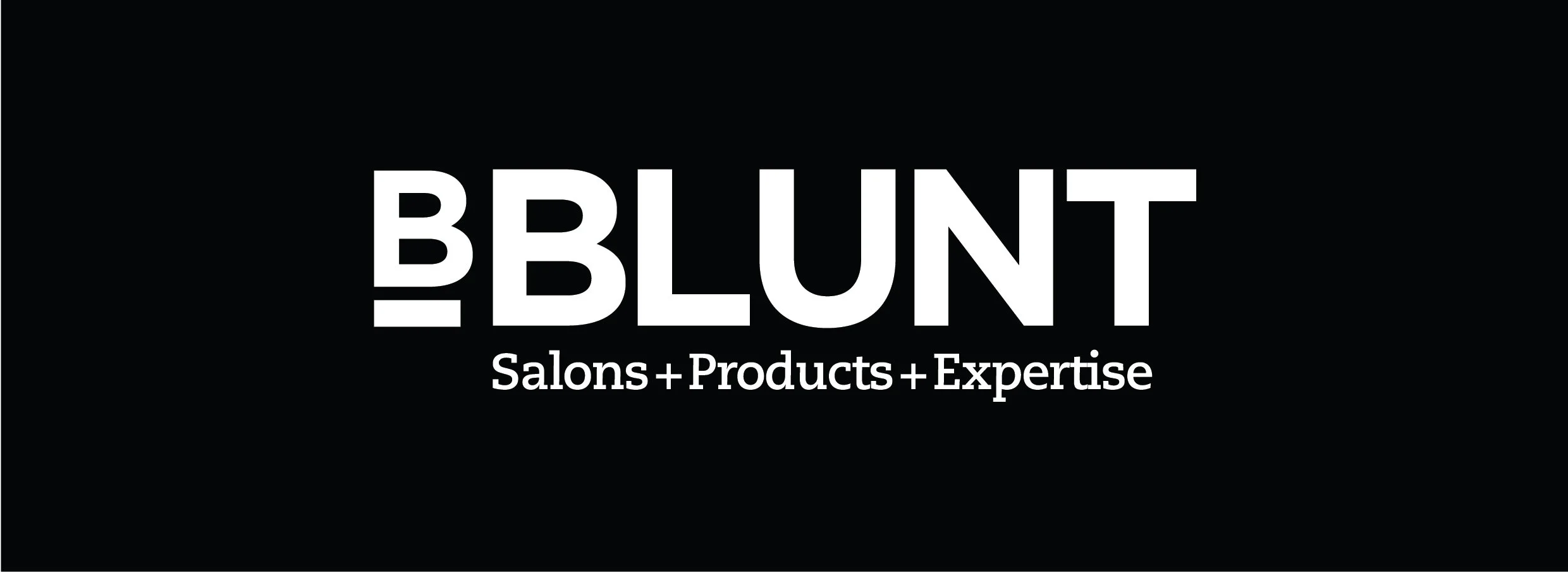
BBLUNT
Company
BBLUNT
My Role
Art Director
Visual Designer
Year
2018
Overwiew
Challenge
BBLUNT is India’s leading salon brand — the name behind countless Bollywood films, Netflix shows,
and runway looks. Known for redefining Indian hair styling, the brand represents fashion, film, and
everyday confidence through its salons, products, and professional expertise.
The goal was to create a cohesive identity that reflects BBLUNT’s dual nature — premium yet
playful, fashion- led yet approachable. The brand needed a system bold enough for the spotlight,
yet flexible enough to live across salons, packaging, and digital platforms.
BBLUNT Logo - Print - main colours
BBLUNT Logo - This blue to be used digitally


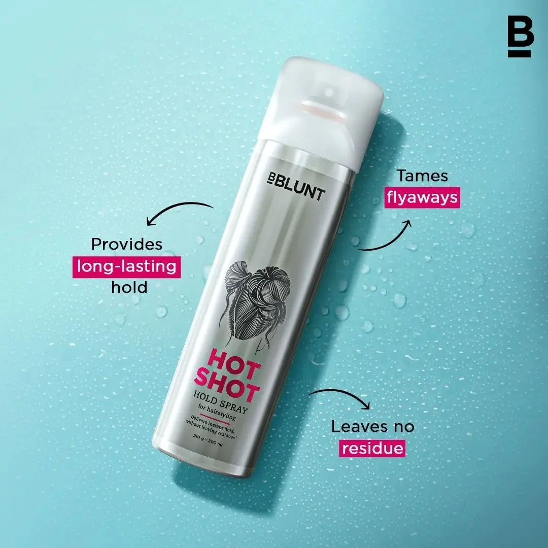
Mock Ups
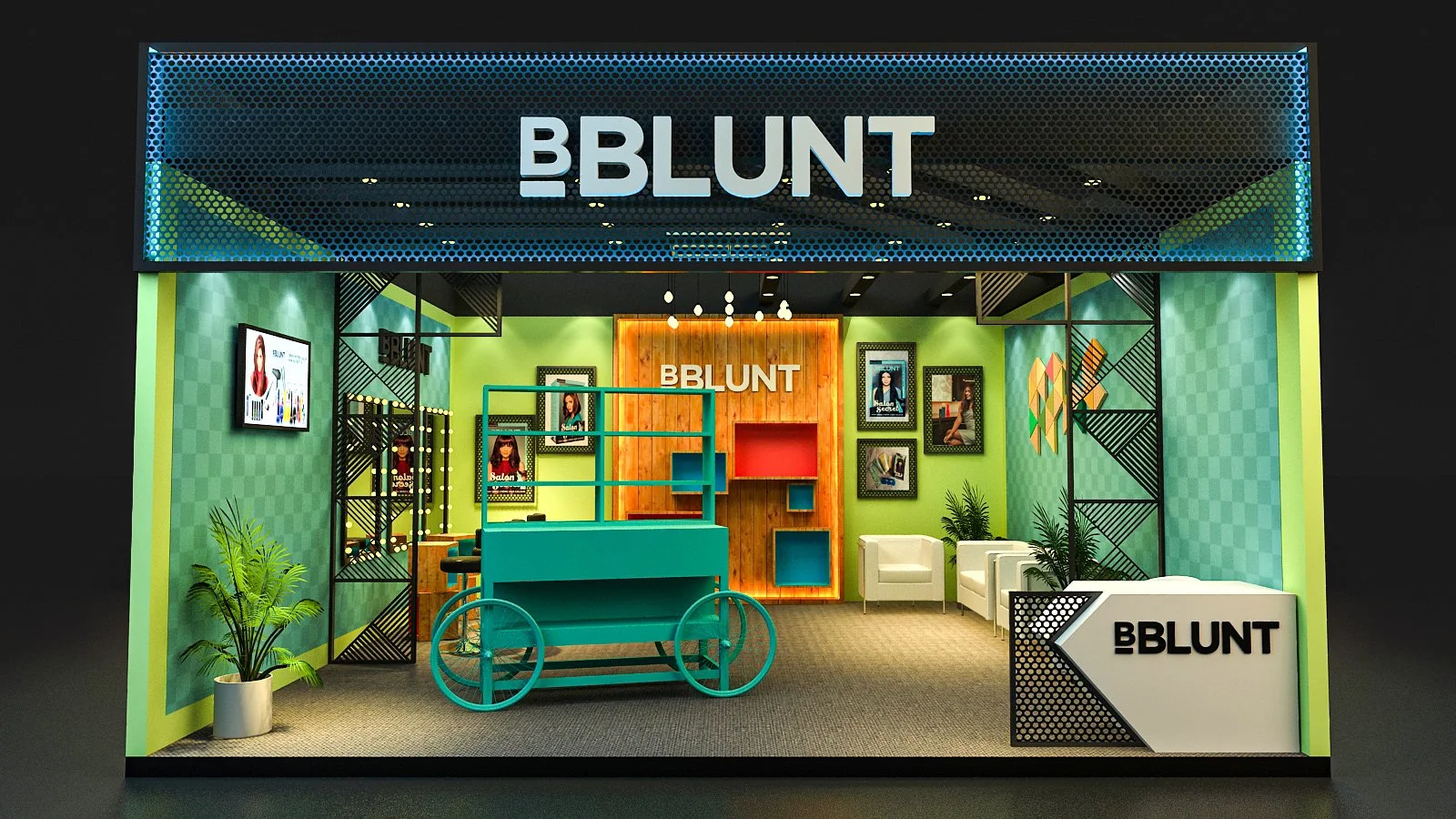
Design System
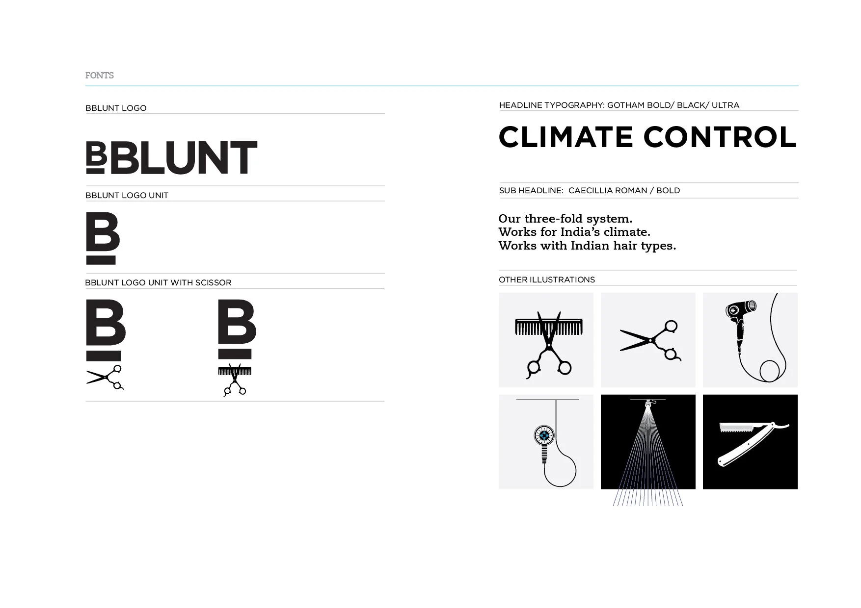
Logo System: A strong typographic wordmark paired with the B_, adaptable across salon signage, products,
and campaigns.
Color Palette: Anchored in BBLUNT Blue (Pantone 305C) — bold, energetic, and instantly recognizable.
B System Icons: The visual framework built around Prep, Transform, Style — representing the brand’s process
and philosophy.
Typography: Clean, geometric letterforms reflecting precision, clarity, and understated confidence.
BBLUNT Logo - Print - secondary colours


Outcome
The refreshed identity unified BBLUNT’s visual language across every touchpoint — from salon
interiors and product packaging to digital and film collaborations.
It re-established BBLUNT as India’s most trusted salon expert, balancing artistry with authenticity
and celebrating imperfection as the new kind of beautiful.
Approach
We built the new identity around BBLUNT’s most iconic element — the B_ (B underscore).
The symbol became the heart of the brand, representing authenticity, transformation, and
confidence in imperfection.
The B_ sits slightly smaller, intentionally imperfect — a reminder that beauty doesn’t come from
flawlessness, but from realness.Just like every hairstyle that grows and evolves, the mark celebrates
individuality — confident, raw, and unapologetically human. Because BBLUNT believes that
imperfection is what makes style truly personal.